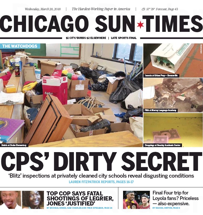
Hello, Sweetheart, get me rewrite: Eight months into its new ownership the Chicago Sun-Times will roll out an entirely redesigned newspaper and website Wednesday.
The new look, new logo and new slogan (“The hardest-working paper in America”) are intended to reflect what CEO Edwin Eisendrath calls “our mission as a news company — that we have the backs of working men and women in Chicago.”
Gone will be the branded pages of USA Today (including national news, world news, business news and national sports news), which have appeared in the Sun-Times since 2015. Stories from USA Today and other wire services will still appear in the paper, but they will be selected and laid out by Sun-Times editors.
“We will be an all-Sun-Times newspaper again for the first time in a very long time,” said Eisendrath, who headed the coalition of organized labor and other investors that bought the financially troubled company last July. With a boost from the U.S. Justice Department, the move thwarted a bid by Chicago Tribune parent company tronc to acquire the Sun-Times.
Working with the Sun-Times on the redesign and rebranding was Ogilvy & Mather, the advertising, marketing and public relations agency.
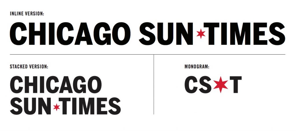
“This is us reclaiming our brand in the wake of the Ferro era,” said Sun-Times editor-in-chief Chris Fusco, referring to the unpopular Michael Ferro, who headed former Sun-Times parent company Wrapports from 2011 to 2016. Even the new logo is a step in that direction: “We’re taking away the bull’s eye of the Ferro era and replacing it with a star from the Chicago flag, which reflects our ownership by Chicagoans who are members of various unions,” he said. “This is going to be a distinctly Chicago product."
Added Fusco: "We wanted to get this done in the first quarter to make a statement that we’re moving quickly with improving our news products. To be at the point where we can do this in the first year of new ownership was important to us.”


